Metababbolomics
|
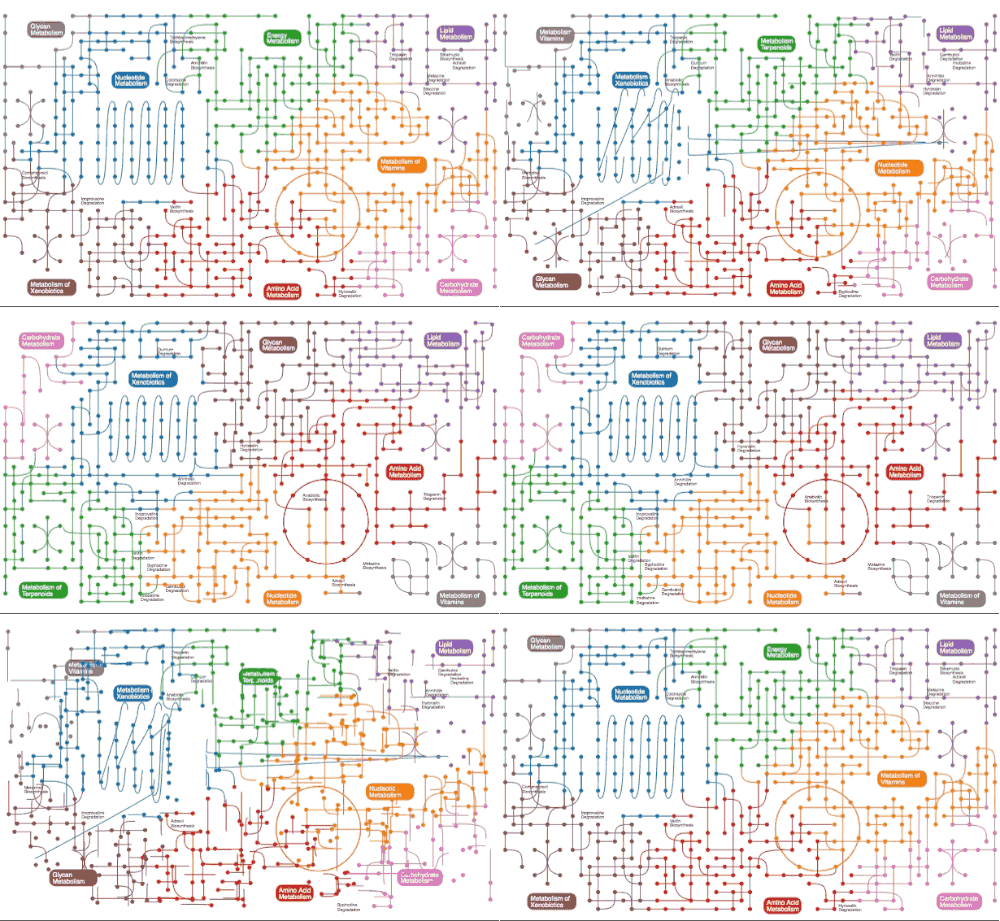
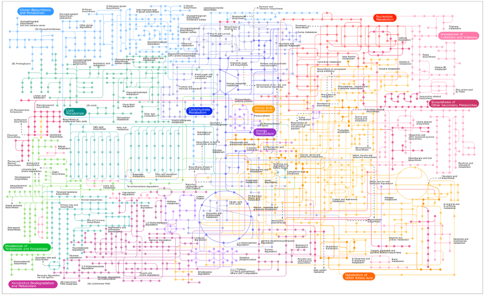
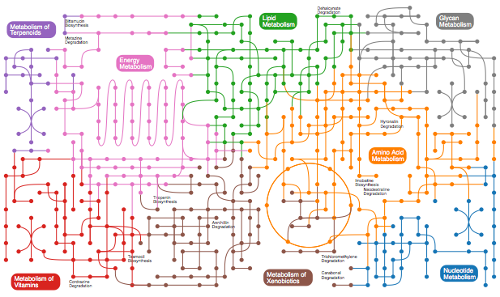
OK, so the idea behind the metababbolomics demo (“art project?”), is to serve as a kind of warning about machine generated content. Basically, it can be utter nonsense but look legitimate, especially if it mimics an expertly hand-curated resource such as KEGG. Consider for example, the downright beautiful overview metabolic map lovingly laid out by its curators:
|
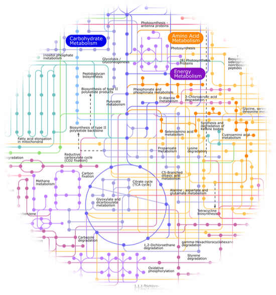
This map is almost flawless, and most importantlly it is backed by tens of thousands of acts of conscious, careful curation. In fact, there are a couple of imperfections in there which betray the hand curation of the metabolic map, which only adds to the charm of this map. You can see them if you zoom in around the Amino Acid Metabolism “area” in the map:
|
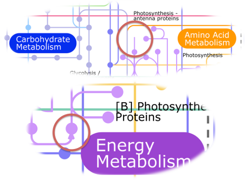
As you can see below there is an edge that points to nowhere and an arrowhead which probably shouldn’t be there, but again, these slight imperfections actually underline the attention to detail in the rest of the map:
|
So, having seen a case of almost perfect layout representing real information, I set out to make an algorithmically generated map, which while “perfect” in the sense of having no layout exceptions, would be a map “about nothing”. I even got fictional chemistry in there (the small black annotations sprinkled around the map) by leveraging a truly bizarre resource I found on wikipedia (you have to see it to believe it)….
Anyway, the result is arguably pleasing on a visual level, but ultimately it serves as a warning :-)
|
